How do traditional fishermen understand scientific charts?

Context
Fisheries monitoring and collaboration with local fishermen are fundamental aspects for effective management that would lead to local and sustainable benefits. The presentation of the monitoring results to the different actors is central. This allows them to understand the purpose of the data they provide and to build a relationship based on mutual trust between the different stakeholders (Blue Ventures, 2021). It also helps to better inform and understand the management decisions and to integrate them more easily into their daily practices (McClanahan et al., 2016).
Yet, the idea that only people with a scientific background are able to understand and interpret scientific data and graphs is still deeply ingrained (Balchin, 1972; Stengers, 2011). And traditional fishermen in emerging countries often have little or no scientific education. Is conveying scientific information to them through graphical representations relevant? YES! But not in any way. The study conducted by Sophie Neitzel et al. (2017) proves that Indonesian fishermen, discovering scientific graphs for the first time, are able to understand them, even interpret them, and also understand their importance for their fishing habits. For this, the way the data are presented and their order of presentation are important.
How was the study conducted?
Twenty tuna anglers from Buru Island, Indonesia (Figure 1), with low literacy overall, were interviewed by a researcher and a translator (Neitzel et al., 2017). In one-on-one interviews, fishermen were first asked various questions, including their fishing habits.
Then, the graphs were presented one by one and in increasing order of complexity (Figure 2). No fisherman was familiar with these types of representations before, which was asked at the beginning of the interview. These figures represent the monthly averages of the fisheries at the province scale (quantity and types of tuna caught in particular). For each graph, the fisherman was first asked to explain his understanding of the graph. Then he was asked specific questions (e.g. “Can you explain to me exactly what the information on the X and Y axes mean?“). Then, the graph was explained to them and they could discuss its relevance to their own experience. Each angler then rated whether the explanations helped them understand the graph better.
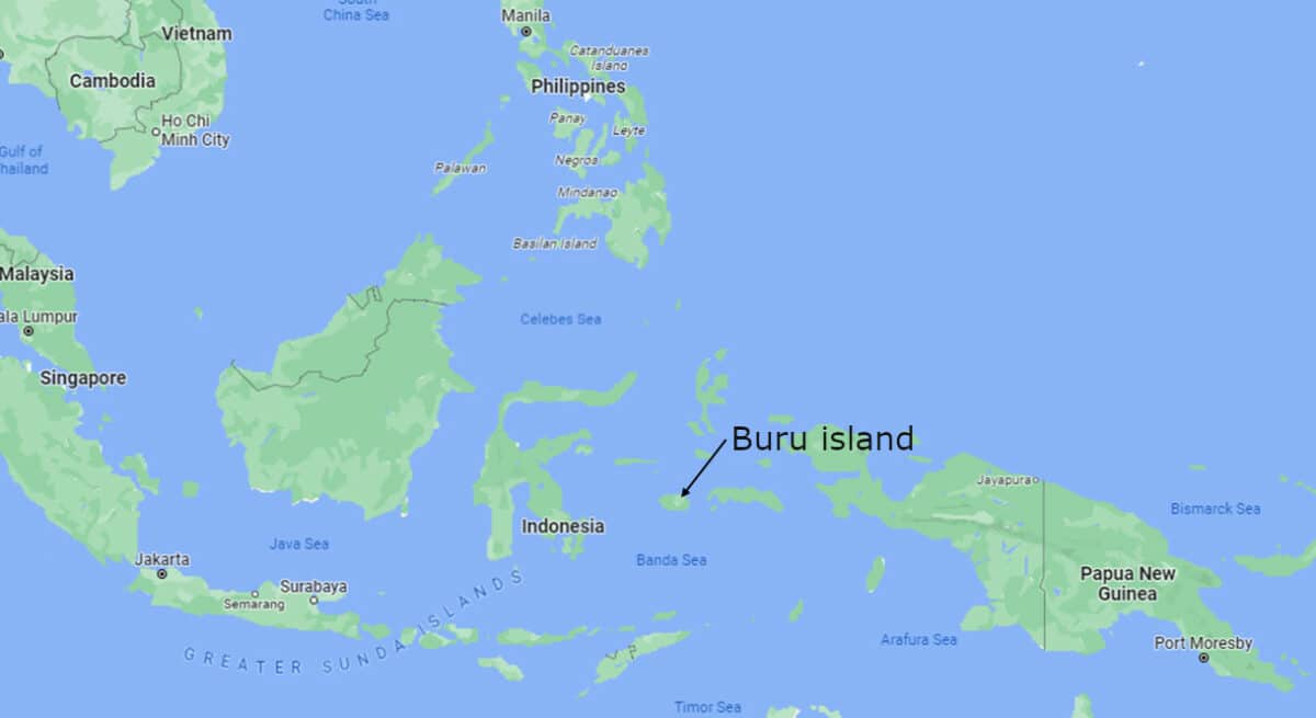
Figure 1: map showing Buru island localization in Indonesia.
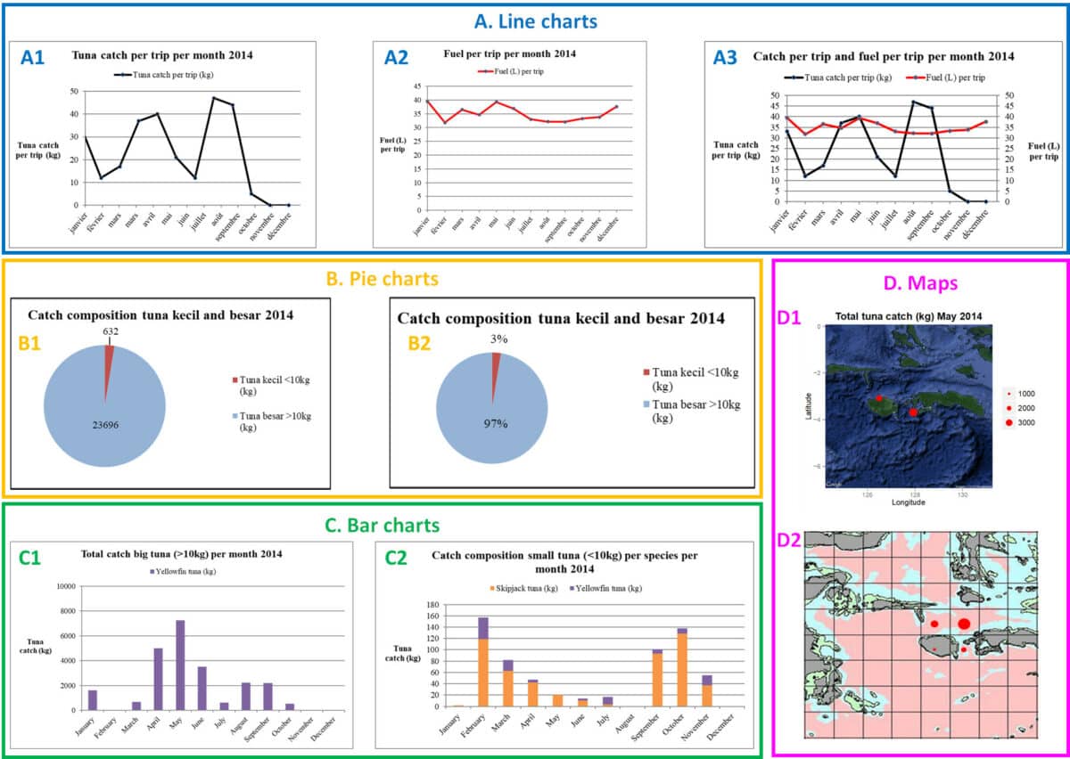
Figure 2: Charts presented to Indonesian fishermen, classified by type: line charts (A), pie charts (B), bar charts (C) and maps (D) (adapted from Neitzel et al., 2017).
Results
The authors of this study first showed that education level (elementary, middle school, or high school) had no impact on graph comprehension, contrary to what one might think (Neitzel et al., 2017). The best understood graph was the line chart (A). The presence of two lines (A3) decreased comprehension. In addition, it was observed that when one type of chart was presented just before, the second of the same type was better understood by the anglers.
Similarly, after the explanations, the majority of the fishermen felt that they understand the graph better. Thus, the degree of understanding increases with the level of explanations. The only exception was the colors, which caused a lot of misunderstanding among the fishermen. Thus, the pink map (D2) does not speak to them, they prefer when the blue and green colors are used to represent the sea and land, respectively (D1). In the bar charts, the purple was used in the second chart (C2) but did not represent the same fish as in the first chart (C1), disturbing the fishermen.
The presentation of the results also affects the understanding of the data: the pie chart is better understood if the catches are displayed in kg (B1) rather than percentages (B2). Thus, the closer the figures presented are to their daily lives, the more easily the fishermen are able to understand them.
Conclusion
This research studied the perception and understanding of traditional fishermen to the representations of scientific monitoring results, in order to better guide the methods of feedback locally. Here, traditional fishermen are able to understand data presented in the form of scientific charts as long as they are kept as simple and close to their daily lives as possible and paying attention to the coherence of colors. Additional explanations given by the researchers were also shown to contribute to the better understanding of the charts by the local fishermen.
It is essential that time for exchange between all the stakeholders, managers, decision-makers and local fishermen, exists through the management process. By giving numerical feedback to the fishermen, the decision-makers and managers allow them to understand the stakes of the data collection and the interest they can find in it (Duggan and Kochen, 2016; Prescott et al., 2016). The data thus understood should allow fishermen to better understand the impact of their fishing habits and to modify them if necessary, by adapting fishing locations, trip times, among others, according to the context.
Similarly, policy makers can learn things that the data do not tell them through discussion with fishermen, and make collaborative decisions. So far, no long-term studies have been conducted to define whether or not exchanges around fishermen’s collected data have an impact on the fishing practices of the fishermen involved (Neitzel et al., 2017). But from a human perspective, they do build trust and engage different stakeholders in the marine resource monitoring and management process (Blue Ventures, 2021).
Bibliography:
Balchin, W.G.V., 1972. Graphicacy. Geography 57, 185–195.
Blue Ventures, 2021. Community engagement with data: a practitioners guide and toolkit for using data in community based marine management.
Duggan, D.E., Kochen, M., 2016. Small in scale but big in potential: Opportunities and challenges for fisheries certification of Indonesian small-scale tuna fisheries. Marine Policy 67, 30–39. https://doi.org/10.1016/j.marpol.2016.01.008
McClanahan, T.R., Sebastián, C.R., Cinner, J.E., 2016. Simulating the outcomes of resource user- and rule-based regulations in a coral reef fisheries-ecosystem model. Global Environmental Change 38, 58–69. https://doi.org/10.1016/j.gloenvcha.2016.02.010
Neitzel, S.M., van Zwieten, P.A.M., Hendriksen, A., Duggan, D., Bush, S.R., 2017. Returning information back to fishers: Graphical and numerical literacy of small-scale Indonesian tuna fishers. Fisheries Research 196, 96–105. https://doi.org/10.1016/j.fishres.2017.08.005
Prescott, J., Riwu, J., Stacey, N., Prasetyo, A., 2016. An unlikely partnership: fishers’ participation in a small-scale fishery data collection program in the Timor Sea. Rev Fish Biol Fisheries 26, 679–692. https://doi.org/10.1007/s11160-015-9417-7
Stengers, I., 2011. Pour une intelligence publique des sciences. Alliage 69, 24–34.
Ces articles pourraient vous intéresser
JOB DESCRIPTION: Scientific & Administrative Project Manager – Coral Restoration
Job Title: Scientific & Administrative Project Manager – Coral Restoration Employer: Waka Eling Semeton Foundation Work Location: Indonesia, Flores, Labuan Bajo Contract Type: Fixed-term –…
20 May 2025Gender equality in marine science? Not yet…
Acknowledgments to Sylvaine Giakoumi Gender equality is an unavoidable topic that has been defined as a United Nations goal for 2030 , along with…
20 March 2023